 9800+ TRUSTPILOT REVIEWS


 EN
EN DE
DE FR
FR NL
NL
Japandi decoration suits period apartments better than most people expect. Tall ceilings, plaster mouldings, herringbone floors: everything that could feel ornate actually carries the visual complexity, so the room itself can stay restrained. The work left to do is the palette, the lighting, the textiles, and the single dark anchor that prevents the space from drifting into beige flatness.
This guide walks through practical Japandi decoration choices: how the style holds against period architecture versus a flat new-build, the five-colour palette, the warm-light setup, the textiles that carry the texture work, and the four mistakes that turn a careful interior into the generic Pinterest one.
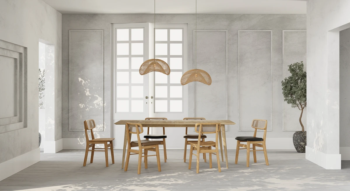
Why Japandi holds in a period flat
The white mouldings, ceiling rosettes, and herringbone parquet that could feel busy actually do the visual work for the room. Japandi does not need an accent wall in a period flat, because the architectural elements already carry the complexity. The reverse rule applies in a flat-ceilinged new-build: you have to add one element (a taupe accent wall, a full-height oak shelf) so the room does not read empty.
Three principles for a period flat:
- Keep the mouldings off-white. No accent paint on the ceiling. Contrast happens at the floor and at eye level.
- Choose low furniture. Sofas at 38 to 42 cm seat height, coffee tables at 30 cm. The vertical room height becomes an asset rather than crushing the furniture.
- One piece of art. Not a gallery wall. One large framed print or a single object on a console handles 25 m² of wall.
In a more recent flat the rules invert slightly: you have to add character rather than let it speak. A custom oak shelf, a smoked-wood panel on a wall, or a single large pendant lamp replaces what period architecture gives for free.
Palette, lighting, textiles
Japandi decoration rests on three layers, built in this order. Skipping a layer or inverting them produces the generic Pinterest result everyone recognises without liking.
The five-colour palette
Off-white walls, sand or light taupe for primary textiles, warm grey for an accent wall or piece, one light wood (oak or ash), and one deep black or cognac anchor.
Six colours starts to feel like a furniture showroom; four reads thin. Five is the right cut.
Warm lighting
One main source per room (paper or natural-linen pendant over the dining table, floor lamp in the living room), plus two or three accent lights on tables and consoles.
No recessed spotlights except in the kitchen. Cool light kills the Japandi mood inside five minutes.
Textured textiles
Natural linen for curtains and cushions, wool or jute for the rug (thick, at least 12 mm pile), undyed cotton for throws, and one pile textile (bouclé or corduroy) on an accent chair or cushion.
Patterns are rare: at most one simple geometric if truly needed. Texture carries the work.
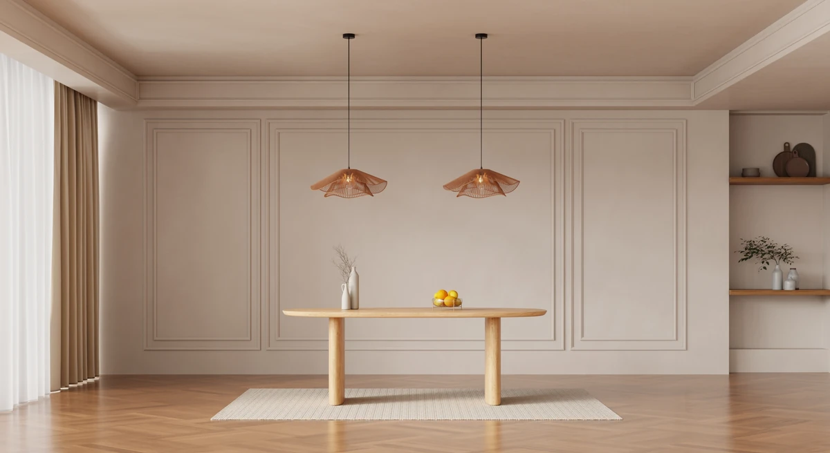
Featured in this guide
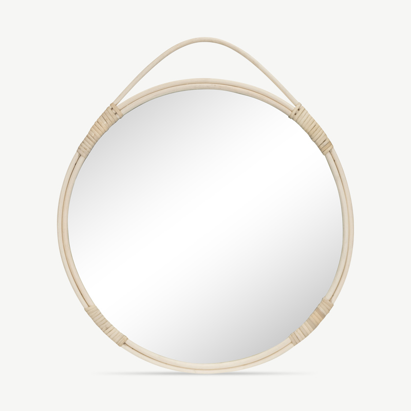


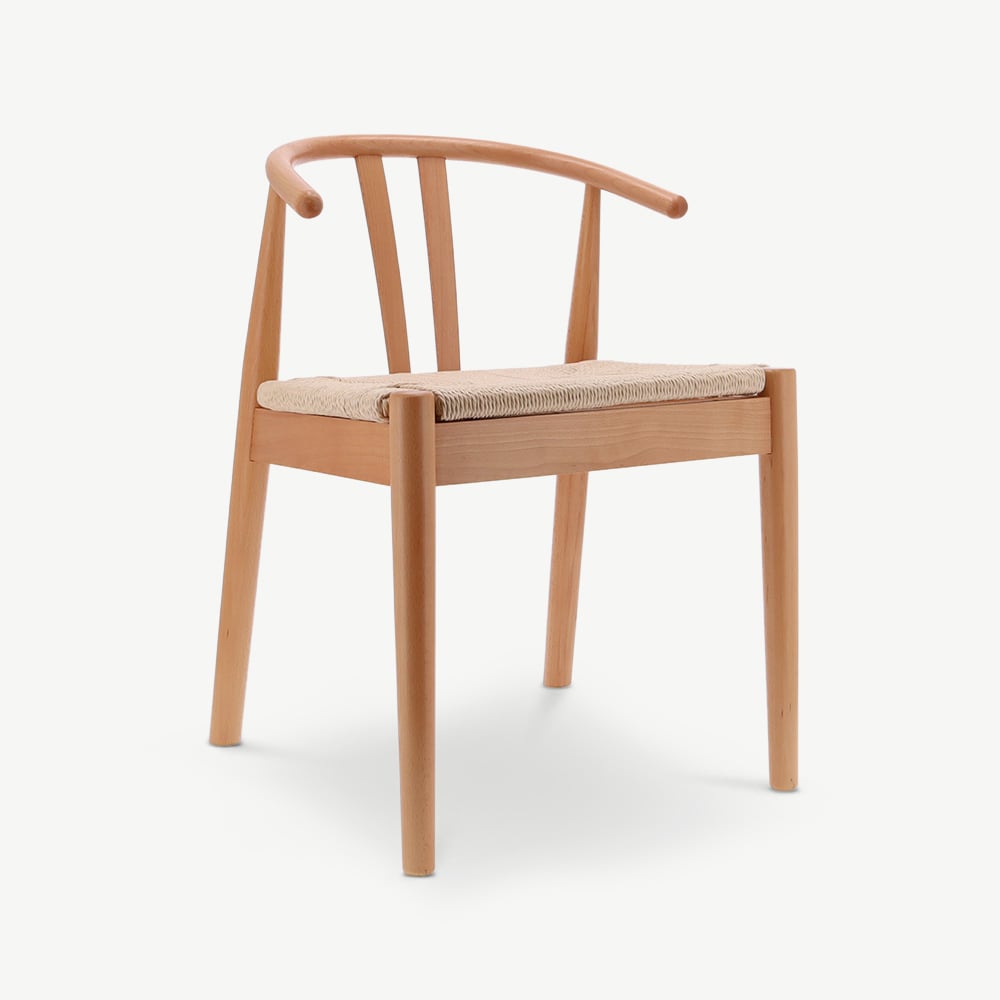

Where Japandi decoration fails
Four mistakes show up in 80% of interiors that attempt Japandi without succeeding. All of them look visually similar to the successful versions, which makes them hard to spot until after the last piece is delivered.
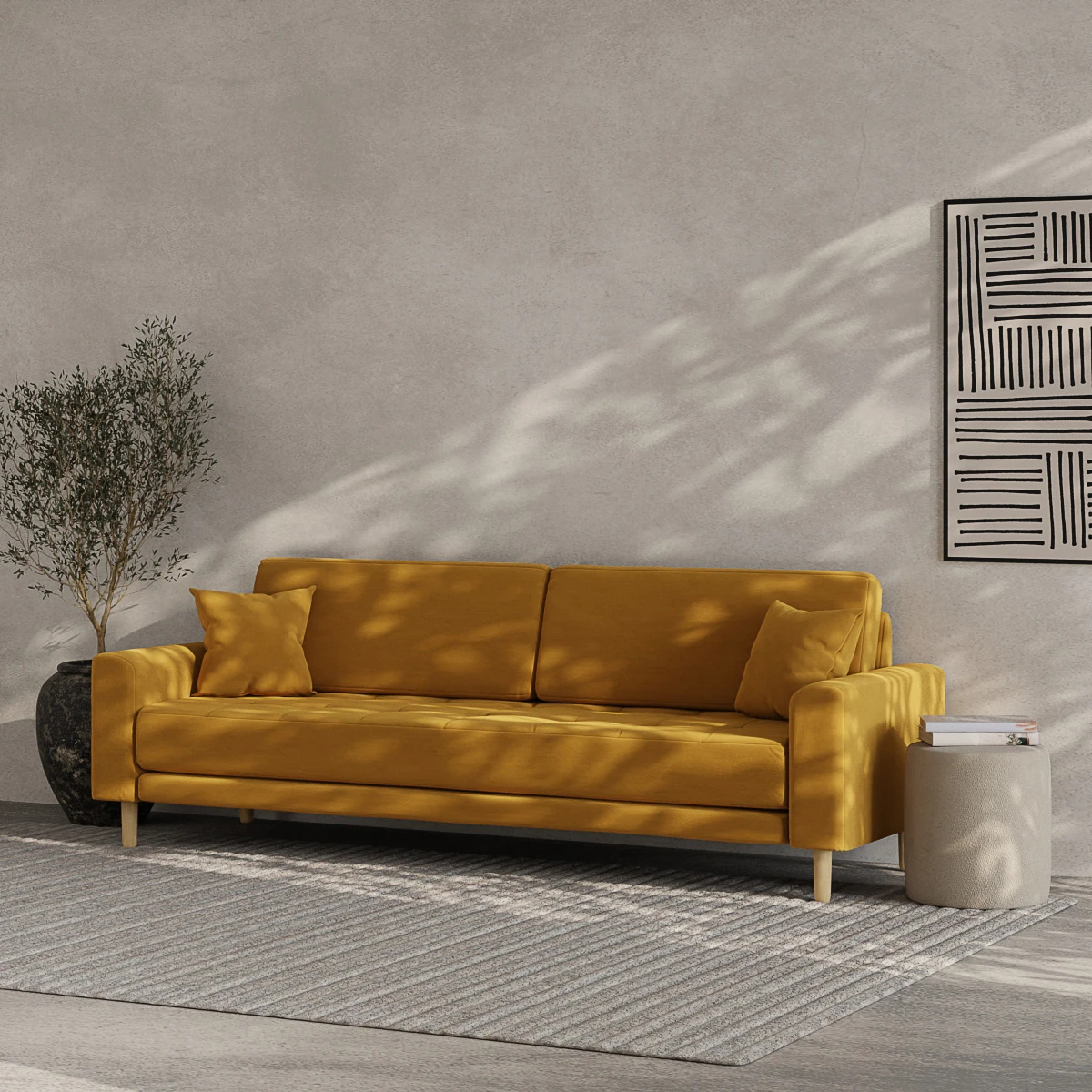
Where to start
Choose the dark anchor first, not the sofa.
The most common sequence mistake: buy the beige sofa first, then try to figure out how to balance the room. Reverse it. A smoked-oak shelf, a black metal floor lamp, a low dark-wood sideboard: choosing one of these first gives the rest of the room a frame the lighter pieces can settle into.
Browse our Japandi collection, coordinated around this logic. Lamps from €89, oak shelves from €249, sideboards from €599. Every piece in the collection accepts a dark anchor without arguing with it.
For the main living-room pieces, read Japandi living room furniture. For the accent chair, see Japandi armchair. To understand the style from scratch, start at what is Japandi style. For the Scandinavian backdrop that overlaps, see Scandinavian furniture guide.
Frequently asked.
Does Japandi decoration work in a period apartment?
Yes, particularly well. Tall ceilings (2.80 to 3.20 m) and white mouldings create a frame the restraint of Japandi can occupy without competition. Low furniture (sofa at 38 to 42 cm, coffee table at 30 cm) emphasises the vertical room height. Leave mouldings in off-white rather than painting them in an accent colour.
What colour palette suits Japandi decoration?
Five colours maximum per room: off-white or eggshell for walls, sand or light taupe for primary textiles, warm grey for a wall or accent piece, one light wood (oak or ash), and one deep black or cognac as anchor. More than five colours creates visual noise; fewer than four reads thin.
What lighting works for a Japandi interior?
One main source per room, plus two or three warm accent lights (2,700 to 3,000 kelvin). Use paper or natural-linen shades, matte black metal for the stands, and indirect light (aimed at the wall or ceiling) rather than direct. Avoid recessed spotlights except where strictly needed.
Which textiles work in Japandi decoration?
Natural linen for curtains and cushions, wool or jute for the rug (thick, at least 12 mm pile), undyed cotton for throws, and one pile textile (bouclé or corduroy) on an accent chair or cushion. Patterns are rare: at most one simple geometric. Texture does more work than pattern.
What are the common mistakes in Japandi decoration?
Four recur: too much uniform beige flattening the room, three different wood tones in the same space, no dark anchor leaving the room floating in pale, and a pursuit of photographable emptiness that leaves the room with no trace of a lived life.
