 9800+ TRUSTPILOT REVIEWS


 EN
EN DE
DE FR
FR NL
NL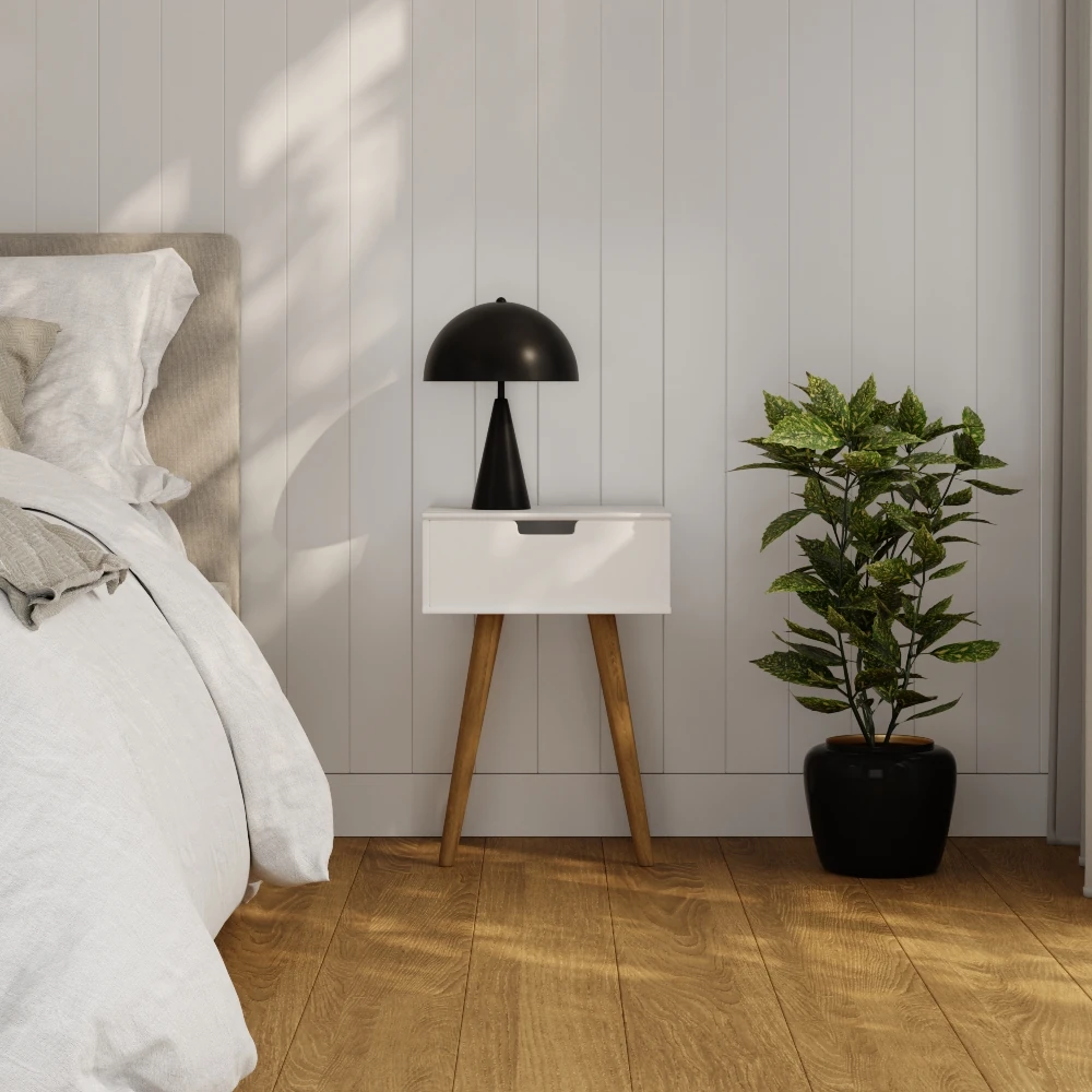
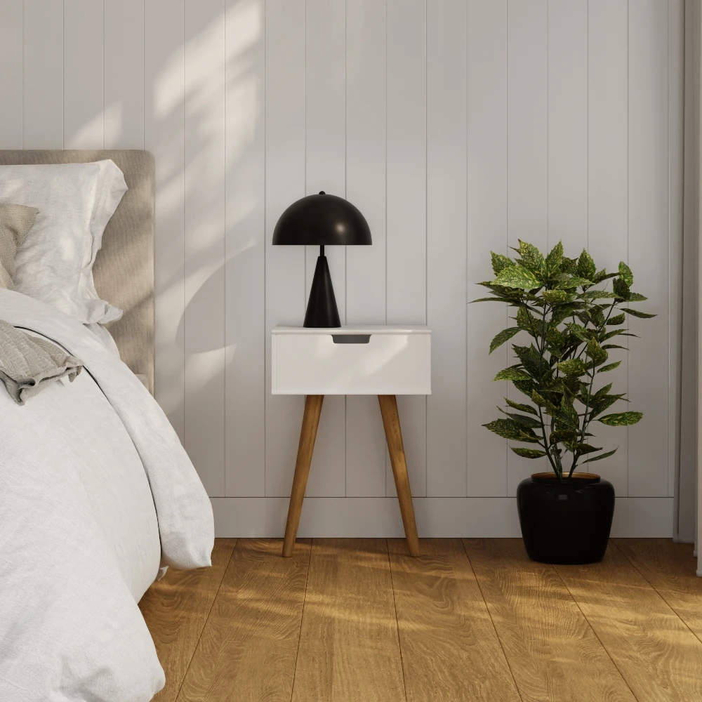
The Scandinavian palette is not white. It is off-white, warm grey, soft black, natural wood, and one accent. Five colours, applied in a specific order, in a specific ratio. The reason it works is geographic: it was developed for rooms that receive three to five hours of direct daylight in winter, and the colours are chosen to amplify whatever light there is.
This guide covers the five core colours, the science behind why pale palettes work in low-light rooms, the accent tones that fit (and the ones that fight the scheme), and concrete paint codes for each of the five core colours.
The palette, in order of dominance
A Scandinavian room is built on five colours in a roughly fixed ratio: about 60 percent off-white, 20 percent warm grey or wood-brown, 10 percent soft black, 8 percent natural wood tone, and 2 percent one accent. Skip any of the five and the scheme starts to feel either flat or restless.
The light logic behind the choices
Each of the five colours does a specific job in a low-light room. Understanding the job is the difference between applying the palette mechanically and applying it well.
Off-white walls
Pure white reflects too much blue and reads cold under cloudy Northern light. Off-white (a touch of yellow or grey added) softens the reflection without losing the brightness. Look for paints in the LRV 78 to 85 range. Examples: Farrow and Ball Wimborne White, Jotun Antique White.
Warm grey for grounding
Grey breaks the white into rooms. Used on one wall, a fireplace surround, or a built-in. Cool greys (blue-tinted) clash with wood; warm greys (slight beige or red tint) sit naturally. Farrow and Ball Skimming Stone, Cornforth White, Pavilion Gray.
Soft black anchor
Pure black 000000 reads as a visual hole and breaks the calm. Use very dark grey-brown or a near-black with warmth (Farrow and Ball Pitch Black, Off-Black). Matt finish only. Applied on one element: pendant, door frame, window frame, a chair.
Natural wood tone
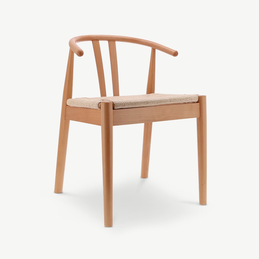
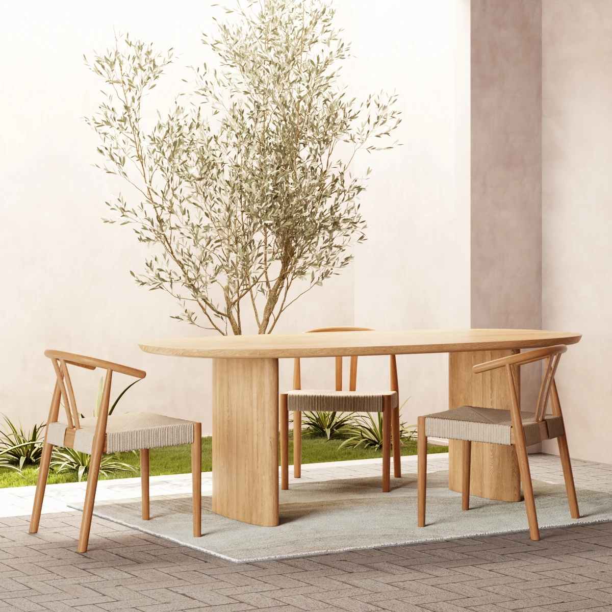
Oak is the canonical wood. Steered toward natural oil finish, not stained. The wood tone is the warmth: without it the room reads as a magazine cutout rather than a home. Floors, tables, chair frames carry the colour.
One accent
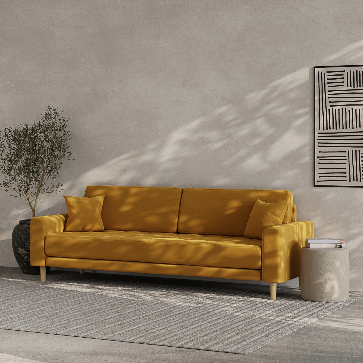
One accent colour per room. Used on cushions, a throw, a ceramic vase, a single chair. Two accents fight; three accents return the room to the cluttered look the palette is designed to avoid. Choose the accent before you buy anything coloured.
Why not bolder colour?
South-facing Mediterranean rooms can take saturated colour because the light is warm and strong. North-facing Nordic rooms can't: saturated colour reads muddy. The pale palette is not aesthetic preference, it is the technical answer to dim, blue-cast daylight.
Featured in this guide



Four rules that keep the palette working
Knowing the colours is not the same as applying them. These four rules turn the palette into a real room.
Putting the five colours in place
Start with walls and floor, then sofa, then accents. The order matters because each layer narrows the next decision.
For the wood layer, our Scandinavian furniture collection has the oak frames, dining tables, and chairs that anchor the natural-wood ratio. For the broader context: complete guide to Scandinavian furniture. For how the palette varies by room: Scandinavian interior decoration. Sofas in off-white linen from €599; oak dining tables from €449; soft-black pendant lamps from €119.
For the stricter Japanese-discipline variant of the same palette: the Japandi guide tightens the accent and adds more depth on the dark end.
Frequently asked.
What are the main Scandinavian colours?
Five colours form the palette: off-white (about 60 percent), warm grey (20 percent), soft black (10 percent), natural wood tone (8 percent), and one accent of your choice (2 percent). Skip any of the five and the room reads flat or restless.
What is the best accent colour for a Scandinavian room?
Five accents fit the scheme without fighting it: mustard yellow, ochre, terracotta, dusty blue, and sage green. Pick one per room. Bright primary colours, neon, and saturated jewel tones (emerald, sapphire) fight the muted base and pull the scheme out of balance.
Should I use pure white in a Scandinavian room?
No. Pure white reflects too much of the blue cast in Nordic and Northern European daylight and reads cold. Off-white (a touch of yellow or warm grey added) softens that reflection. Look for paints with a Light Reflectance Value of 78 to 85, matt or eggshell finish.
What wood tones fit the palette?
Natural-finish oak is the canonical choice, followed by ash and beech. Honey to mid-brown tones with visible grain. Avoid stained darks (walnut, ebony) as the main wood, as they introduce a strong colour the palette is designed to keep neutral. Stained darks work as small accents (one chair, one frame).
Can I use black in a Scandinavian room?
Yes, in small doses and never pure 000000. Soft black or very dark grey-brown anchors the scheme. Used on one element per room: a pendant, a door frame, a chair, an art frame. Matt finish only. Pure glossy black breaks the calm and reads as a visual hole rather than a warm anchor.
Why does the Scandinavian palette feel calm?
Because the colours are close in tonal value (mostly mid-to-light, with a single dark anchor) and the saturation is low. The eye does not have to work to balance competing colours. That calm is the design intention: the palette was developed for rooms that get little daylight and need to feel restful through long winters.
