 9800+ TRUSTPILOT REVIEWS


 EN
EN DE
DE FR
FR NL
NL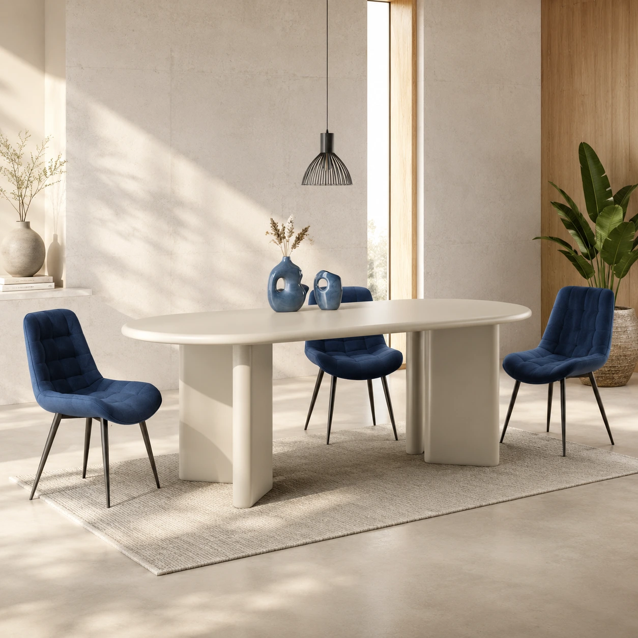
Both terms get used as if they meant the same thing. They do not. Wabi-sabi is a Japanese philosophy that predates modern design by several centuries. Japandi is an interior style that emerged around 2016, borrowing some of wabi-sabi's instincts and pairing them with Scandinavian function.
One is a way of seeing. The other is a way of furnishing a room. This guide covers where they overlap, where they diverge, and which one to use as your styling lens when you are actually deciding what to put on a shelf.
One is centuries old, the other is eight years old
Wabi-sabi traces back to 15th-century Japanese tea ceremony, where the host's choice of an imperfect, unpolished tea bowl was a deliberate counterweight to the Chinese imported porcelain of the time. The aesthetic became a way to communicate humility, restraint, and acceptance of the natural cycle of decay.
Japandi is a name invented by Western design press around 2016 to describe a recurring pattern: Scandinavian interiors that had been pulling in Japanese influences (low-profile furniture, dark wood accents, natural fibres, paper light) for years before anyone gave the combination a label.
- Wabi-sabi: a worldview informed by Zen Buddhism and Japanese tea culture
- Japandi: a contemporary interior style designed for export and reproduction
- Both: share a preference for natural materials, restraint, and visible craft
Three principles they genuinely share
If you cannot tell which style a room belongs to, it is usually because the room is sitting in this overlap zone. Most of the published Japandi photography lives here.
Natural materials
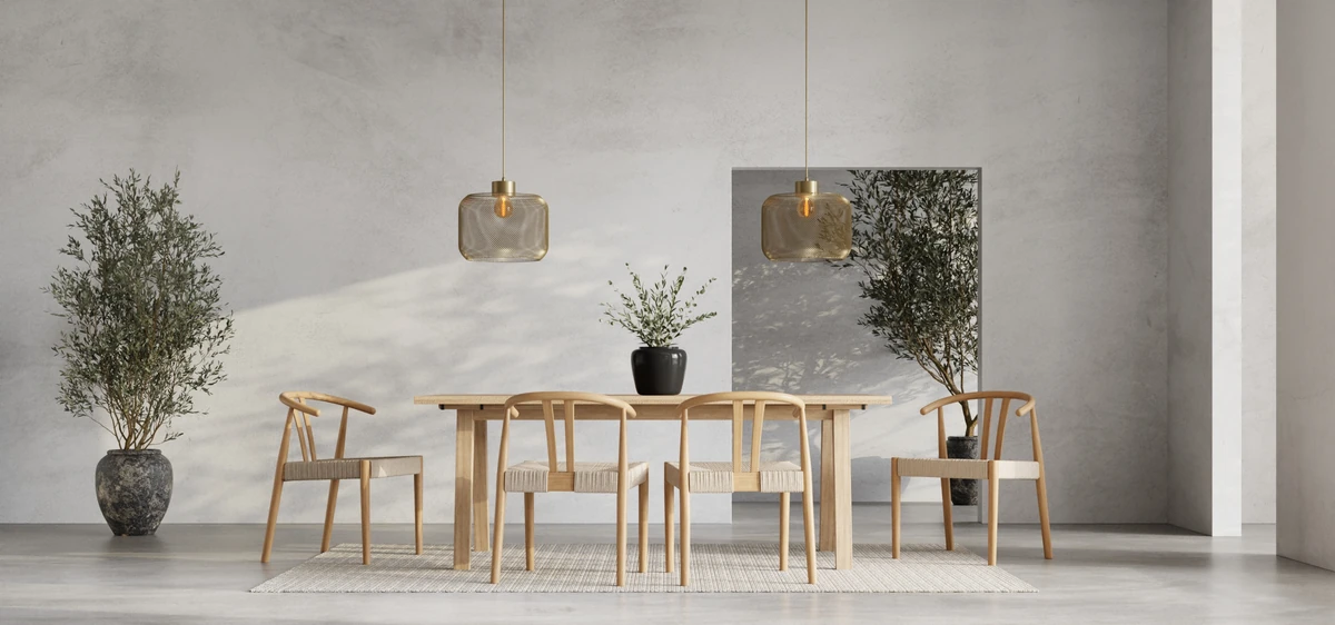
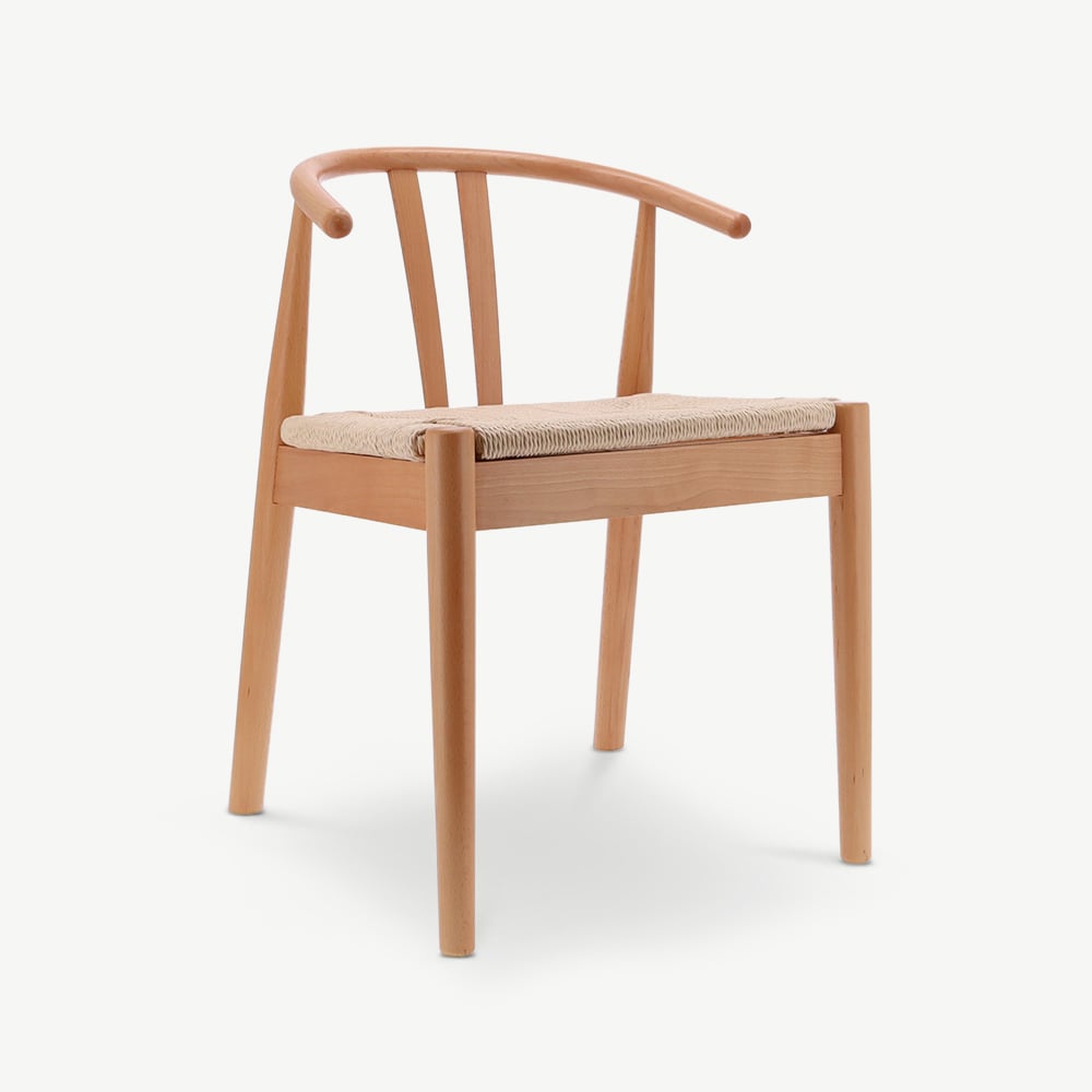
Both styles reject plastic, chrome, and high-gloss synthetics. Solid oak, hand-thrown ceramic, woven rattan, linen with visible texture: these belong in either style without adjustment.
If a material visibly came from a living thing, it is welcome in both vocabularies. This is the largest area of agreement.
Imperfection as a feature
A knot in the wood, a slight asymmetry in a hand-thrown bowl, a linen weave with one fibre slightly heavier than its neighbours: these are not flaws to either style. They are evidence of provenance.
The difference is degree. Wabi-sabi welcomes more rawness; Japandi keeps the edges closer to clean.
Negative space
Both styles leave a lot of room around objects. The piece is allowed to read on its own rather than fight for attention with five other things on the same shelf.
In Japandi, this becomes the 40% rule: at least 40% of the floor stays visible. Wabi-sabi has no rule, only an instinct.
Featured in this guide



Five places they genuinely split
This is where the lines get useful. If you are styling a room and unsure which lens to apply, these five differences resolve most of the questions you will face.
| Question | Japandi | Wabi-sabi |
|---|---|---|
| Edges and finish | Clean, sanded | Raw, unfinished |
| Symmetry | Asymmetric but ordered | Whatever the object asks for |
| Repairs | Replace | Visible (kintsugi) |
| Light | Bright, Scandi-influenced | Soft, lower lumen |
| Density | Sparse | Sparse with patina |
The shortest summary: Japandi cares how a room is composed. Wabi-sabi cares how an object has aged. They are not opposing values, they are different frames. A room can hold both, but the dominant frame decides what gets edited out.
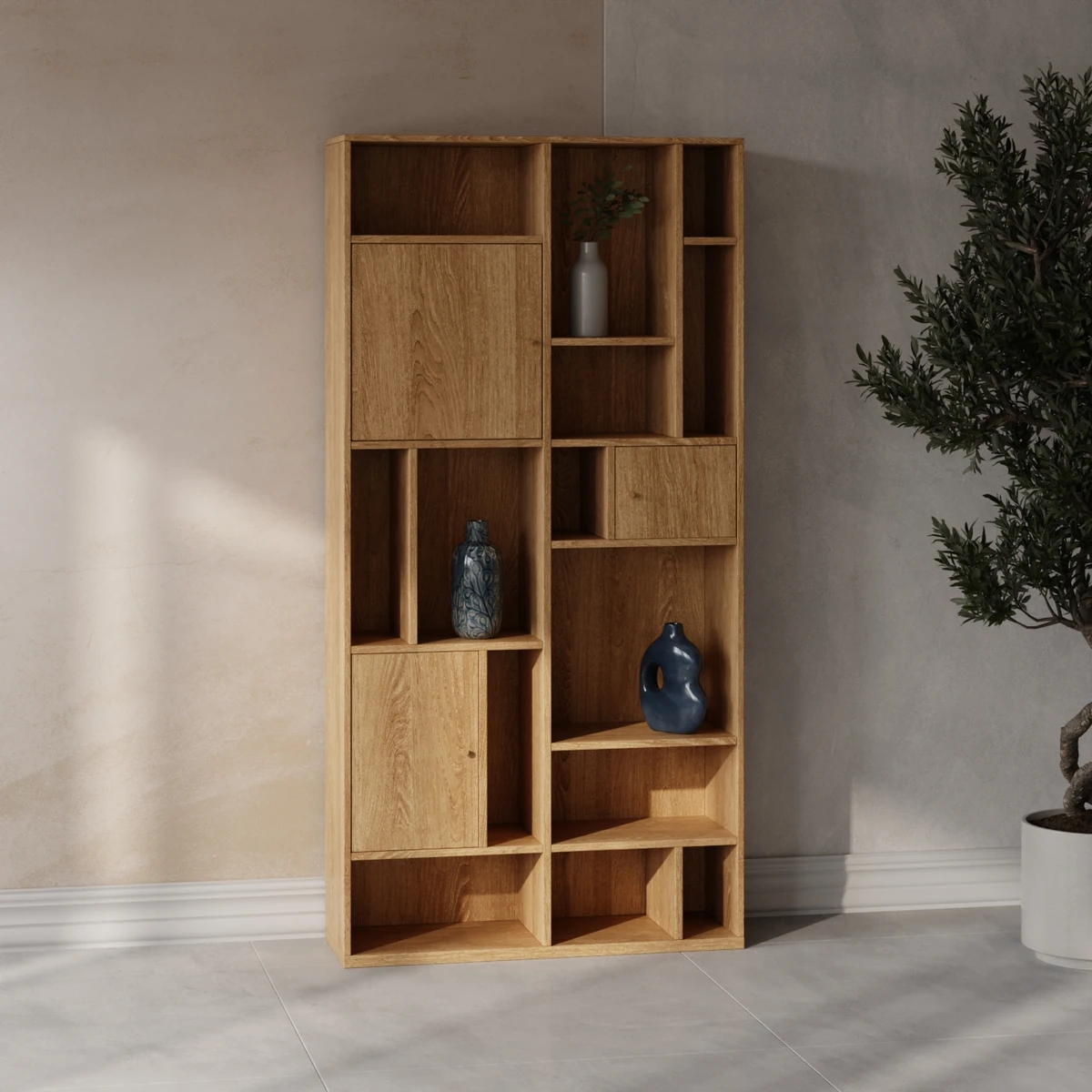
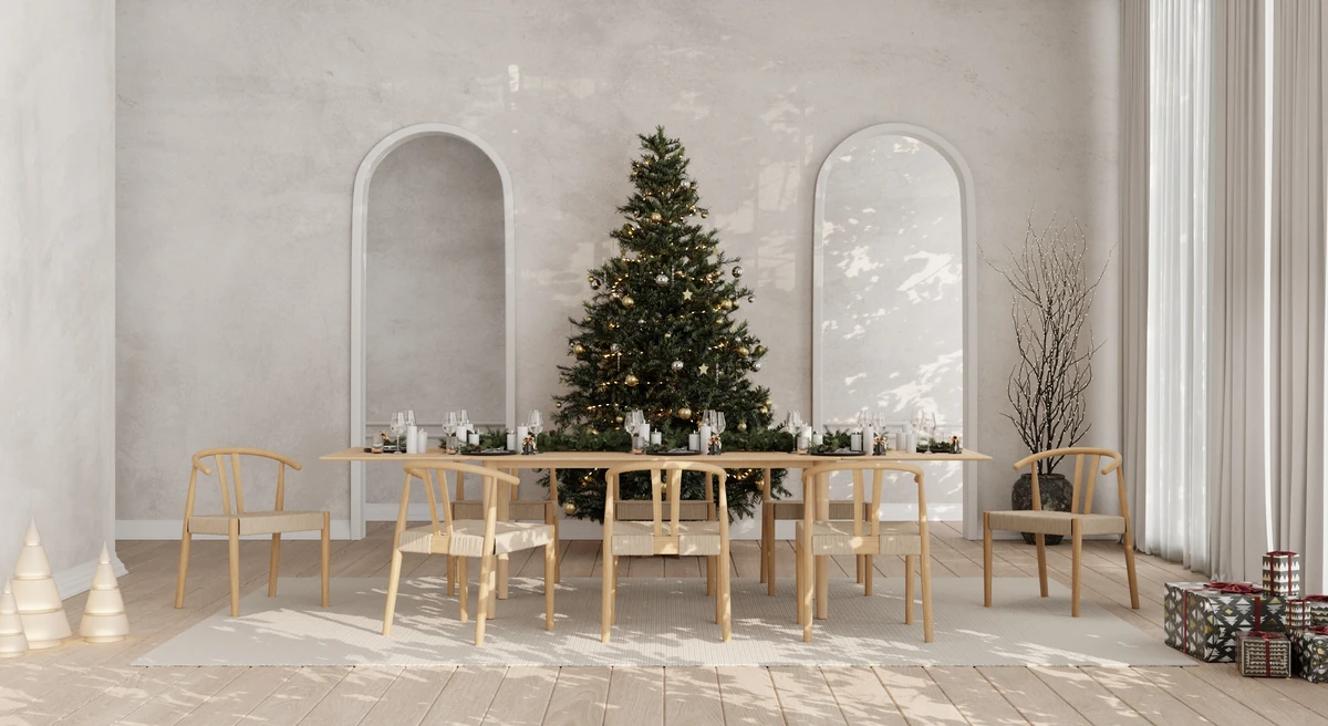
Which style to actually use at home
For most readers, Japandi is the more useful frame. It is buildable from a furniture catalogue, it tolerates electric light and modern flats, and it gives clear rules to follow when you are choosing between two similar pieces. Buy oak and rattan rather than walnut and chrome. Leave the floor visible. Add one dark anchor to break up the lighter tones.
Wabi-sabi is harder to assemble and easier to fake. Real wabi-sabi depends on objects with real history, sourced over time, often inherited or found rather than ordered. Reproducing it from a furniture catalogue tends to produce a Japandi room with a wabi-sabi caption, which is fine, but the label is not earned.
Our advice for a first-time decorator: choose Japandi as the spine of the room. Add one or two wabi-sabi objects later as they appear, the hand-thrown bowl from a market, the linen runner with the off-centre stripe, the small ceramic that came from a friend. These are the pieces that give a Japandi room depth over time.
For more on the foundational style, read our complete Japandi interior guide or what is Japandi style for a shorter overview.
Build the room once, then let it age
Japandi is the easier style to start with. Wabi-sabi is what your Japandi room becomes after ten years of living in it.
The two styles are not in competition. They sit on the same axis at different points, and most homes that aim for one end up holding pieces from both. The pieces that translate without adjustment are solid-wood tables, rattan chairs, linen sofas, ceramic vessels, and paper-shade lights. These are also the bulk of the Furnicher Japandi collection, where most pieces sit between €99 and €890.
If you are weighing Japandi against its Scandinavian neighbour rather than its wabi-sabi cousin, see our Japandi vs Scandinavian comparison. For the material palette underneath both styles, our Japandi materials guide covers what to buy and what to skip.
Frequently asked.
What is the difference between Japandi and wabi-sabi?
Wabi-sabi is a Japanese philosophy of accepting imperfection, impermanence, and incompleteness as sources of beauty. Japandi is a contemporary interior style that borrows wabi-sabi's appreciation for natural, weathered materials but pairs them with Scandinavian structure, function, and brighter light. Wabi-sabi is a worldview that predates modern design by centuries; Japandi is a way of furnishing a room that emerged around 2016.
Can a room be both Japandi and wabi-sabi?
Yes, often. A Japandi room with a hand-thrown ceramic vase, a linen throw that shows its weave irregularities, and an oak table with visible grain qualifies as both. The distinction matters when you push further into rawness: unsanded wood, visible repairs (kintsugi), more clutter and patina move a room toward wabi-sabi and away from Japandi's cleaner edges.
Is wabi-sabi the same as minimalism?
No. Minimalism prizes uniformity, clean geometry, and the removal of decoration. Wabi-sabi prizes character, irregularity, and the marks left by use. A wabi-sabi room can look more cluttered than a minimalist one because the objects in it carry visible history. Japandi sits between the two: it borrows wabi-sabi's natural texture and minimalism's restraint.
Which style is harder to get right at home?
Wabi-sabi is harder. It depends on objects with real history, real craft, and real wear, which are difficult to source and even harder to fake. Japandi is easier to assemble from a furniture catalogue because its rules are clearer: light wood, dark anchor, linen, ceramic, negative space. Most homes that aim for wabi-sabi end up in Japandi territory, which is not a bad outcome.
Does Japandi furniture work in a wabi-sabi room?
Most of it does. Solid oak tables, hand-woven rattan chairs, and linen sofas all sit comfortably in either style. The pieces that do not transfer are the more polished Scandinavian items: high-gloss surfaces, chrome accents, perfectly even finishes. Wabi-sabi wants visible material; Japandi tolerates it. The overlap on furniture is around 80%.
Is Japandi a watered-down version of wabi-sabi?
It is a Western adaptation, which is not the same as watered-down. Japandi takes the wabi-sabi appreciation for natural materials and translates it into a furnishable, photographable style that works in apartments with electric light and modern building codes. Some depth is lost; usability is gained. Both versions have a legitimate place.
