 9800+ TRUSTPILOT REVIEWS


 EN
EN DE
DE FR
FR NL
NL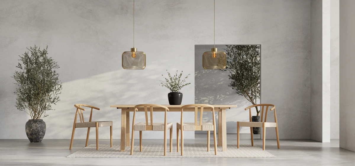
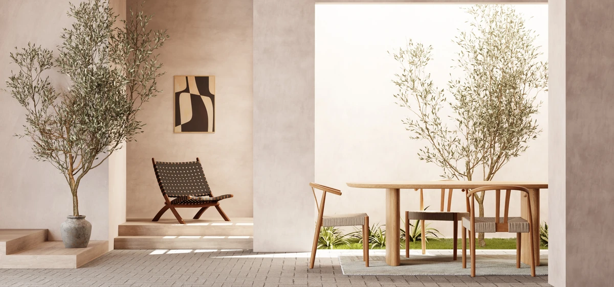
The Japandi palette is five colours, not ten. Off-white, oat, soft black, deep walnut, muted sage. All of them sit at low saturation and reference natural pigments (clay, stone, ash, wood, leaves) rather than synthetic dyes.
This guide covers the five colours individually, explains why they work and where they differ from Scandinavian or modern palettes, and gives you the 60/30/10 rule for practical use in a room.

Low saturation, natural references
What separates the Japandi palette from a Scandinavian one is not primarily brightness. It is saturation. Scandinavian rooms often carry one bright, true colour as an accent: a clear yellow, a clean teal. Japandi rooms never do.
Instead, every Japandi colour references something that occurs in nature: off-white like unbleached linen, oat like unshelled grain, soft black like wet ash, brown like oiled walnut, sage like the leaf. The test before you buy a swatch: can you trace the pigment to something plant-based or mineral? If yes, it belongs. If the tone reads as plastic or neon, it does not.
- Saturation: always below 30% (measured in HSL)
- Undertone: warm, with a slight beige or yellow lean, never cool blue
- Reference: every tone maps to a natural source
The Japandi palette in detail
Each of these five colours plays a role. They are not interchangeable suggestions but five functions a complete Japandi room needs.
Off-white (oat milk)
The foundation colour. Wall paints with a beige undertone (Farrow & Ball Slipper Satin, Pointing) and large upholstery pieces in unbleached linen. Reflects daylight without cooling the room.
Oat (warm sand)
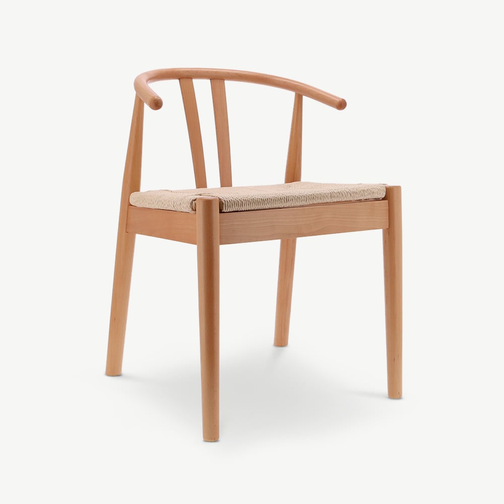
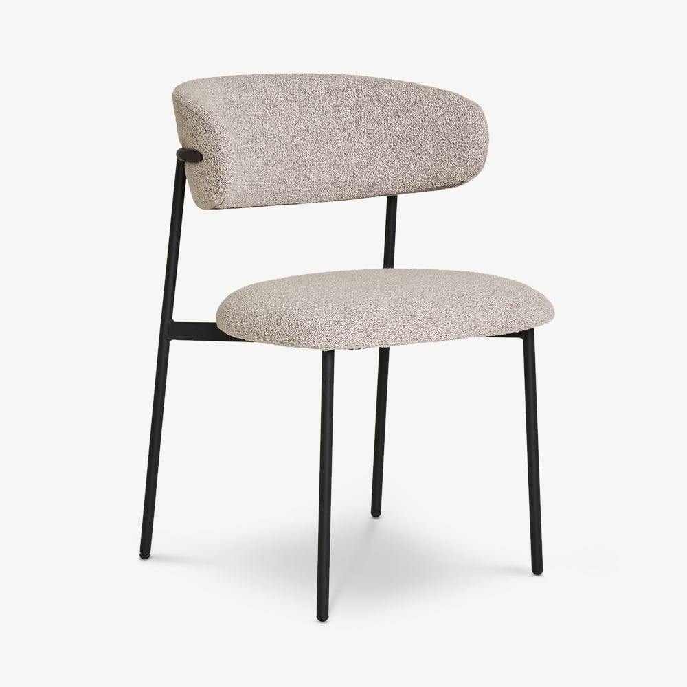
The wood tone. Oiled oak, unbleached boucle, natural linen. Warms the room visually and takes the largest share of visible surface after the base.
Soft black
Not pure jet black: a black with a slight brown undertone. Black-stained oak, smoked ash, a lamp or shelf frame. About 10% of the visible surface.
Deep walnut
The second dark tone, slightly warmer than black. Walnut veneer, smoked oak in natural finish, dark ceramic. Breaks the monochrome without tipping the style toward industrial.
Muted sage
The only colour accent in the standard palette. A muted, dusty sage, not a clean mint. Works on a feature wall, a cushion, or a vase. Not necessary in every room.
Terracotta (sparing)
The warmest accent allowed. Low saturation, more burnt earth than orange. Works in a ceramic vase or a flat-weave rug. Maximum one piece per room.
Featured in this guide



The 60/30/10 rule translated to Japandi
The classic interior rule works particularly well in Japandi because it prevents the already-muted palette from reading flat. Distribute the colours like this:
| Share | Colour | Where it appears |
|---|---|---|
| 60% | Off-white | Walls, ceiling, sofa, large textiles |
| 30% | Oat + walnut combined | Wood floor, wood furniture, upholstery accents, rattan |
| 10% | Soft black | Accent chair, frame, lamp, vase |
Optionally replace 5% of the black share with sage or terracotta if the room is reading too monochrome. Important: only one of these accent colours per room. Sage and terracotta together tip the palette out of balance.
When judging in the room, use the half-to-half test: hold a wood sample (oiled oak) against a wall paint swatch. If the two read warmer and quieter together, they are compatible. If the swatch jumps out visually, it is too cool or too saturated for Japandi.
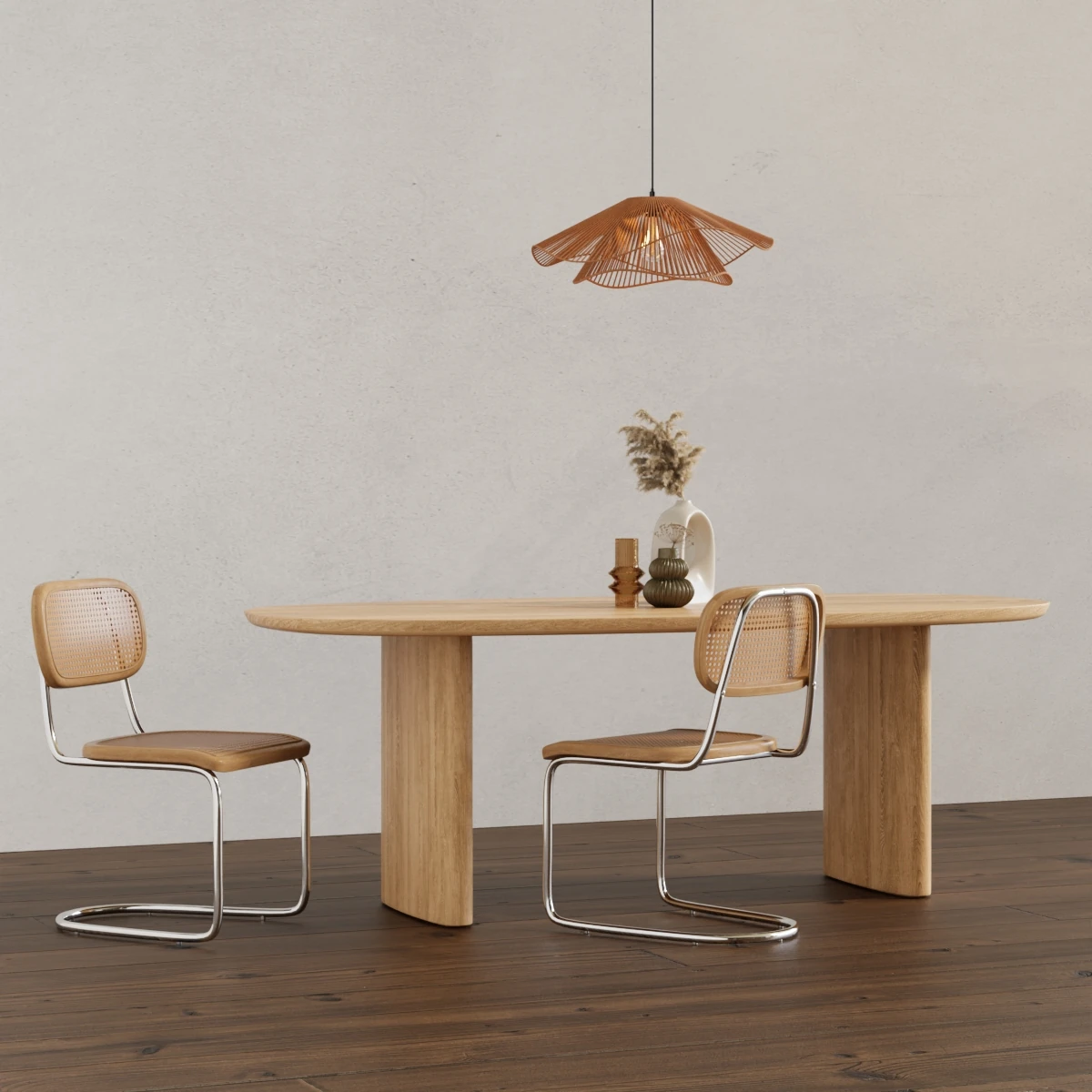
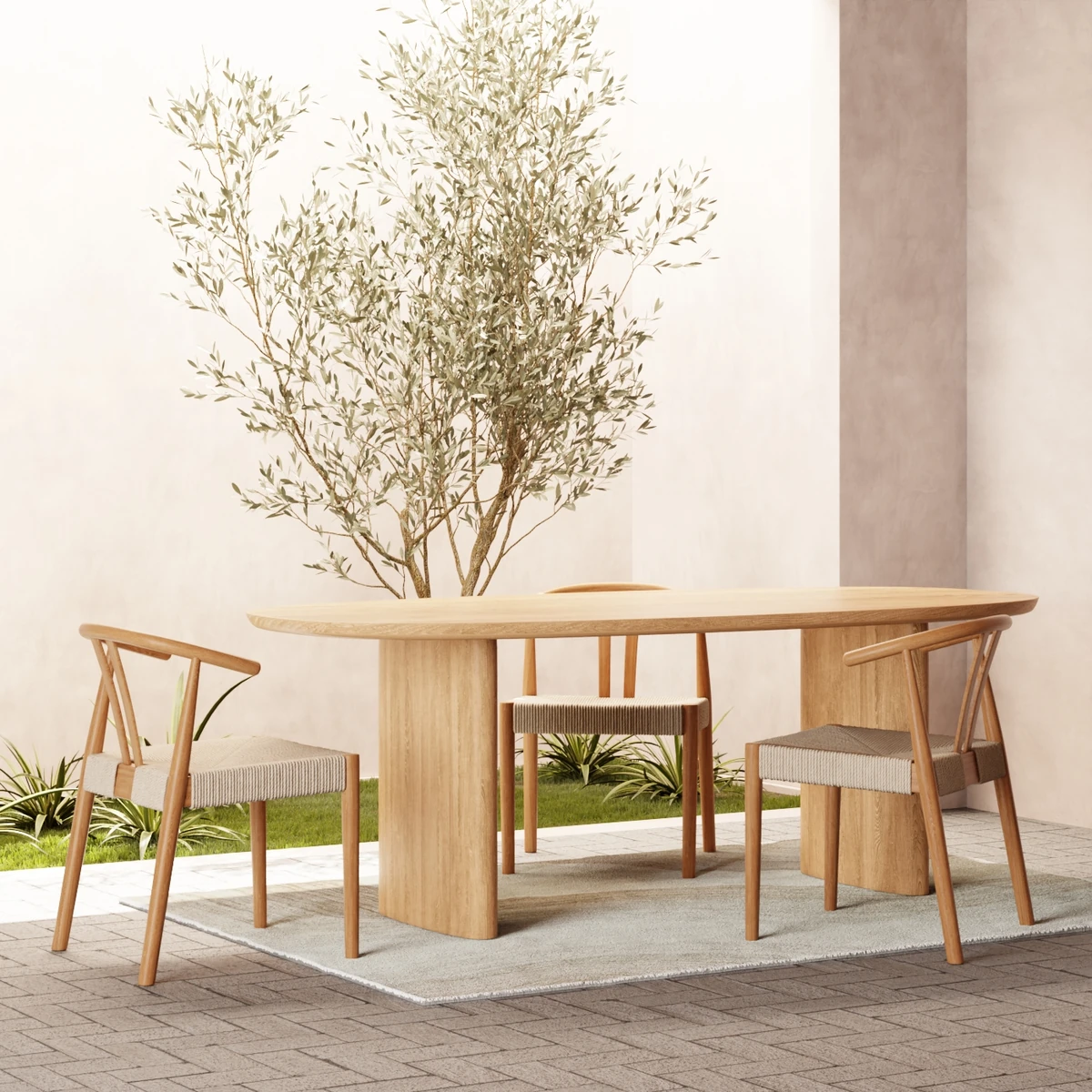
The most common misses
Five colour groups often show up in Pinterest searches as supposed Japandi but are not. If you have one of these in your selection, you are pulling the room toward Scandinavian, modern, or boho rather than Japandi.
- Pure white: reads clinical and cold; replace with off-white with a beige undertone
- Bright pastels: baby blue, pink, lemon yellow belong in the Scandinavian palette
- Cool grey: bluish greys tip the room into modern; warm greige tones are the Japandi alternative
- High-gloss jet black: reads industrial; matte soft black with a brown undertone stays in the Japandi vocabulary
- Saturated primary colours: clean yellow, turquoise, fire-engine red read as Scandinavian or mid-century, not Japandi
If you are looking for furniture pieces in the palette, most of these colours sit in the Japandi collection. For the material side of the palette, our Japandi materials guide goes deeper.
Five colours, one mood
The Japandi palette is not built to make a room more colourful. It is built to make it quieter.
That is the point. You pick Japandi colours not to stand out but to make a pause, a room that does not ask for attention. Off-white and oat as the base, walnut and soft black as anchors, muted sage or terracotta if you need a note. Nothing more.
In our Japandi furniture collection most pieces sit between €99 and €890 and carry the palette without adjustment. The dining chairs in black-stained oak work as the 10% anchor, and the rattan furniture reliably brings the oat tone into a room.
For the bigger picture, read our Japandi interior guide and the comparison Japandi vs Scandinavian, where the palette difference sits in context.
Frequently asked.
What colours belong in a Japandi palette?
Five colours carry the whole range: off-white, oat or warm sand, soft black, deep walnut brown, and muted sage. All of them have low saturation and reference natural pigments (clay, stone, ash, wood, leaves). Bright primary colours and cool pastels do not belong.
How does the 60/30/10 rule work in Japandi?
60% dominant base colour (off-white or warm sand on walls and large surfaces), 30% secondary natural tones (wood floors, linen upholstery, rattan), 10% dark anchor (soft black or walnut on accent pieces like a chair, shelf, or vase). The rule prevents the muted palette from reading flat.
What wall colour works for Japandi?
Off-white with a warm beige undertone is the safest choice. Specific paint references: Farrow & Ball Slipper Satin, Pointing, or School House White. For smaller rooms where you want a darker anchor on the wall, muted sage (Card Room Green) or warm charcoal work. Pure white reads too cool for Japandi.
Does grey work in a Japandi palette?
Warm greys with a beige or brown undertone (greige) work. Cool, blue-leaning greys do not. The test: hold the swatch next to a piece of untreated oak. If the grey looks warmer, it is Japandi-compatible; if it looks colder, it belongs in Scandinavian or modern rooms instead.
Can black be used in Japandi rooms?
Yes, deliberately. Soft black (not pure jet black) is the most important dark anchor in Japandi. Use it in focused doses: a black-stained chair, a shelf frame, a vase, a lampshade. About 10% of the visible surface per room is enough. More than that tips the style toward industrial.
What accent colours work in Japandi?
Accents stay in the muted, natural-pigment range: low-saturation terracotta, deep aubergine, deep forest or sage green, burnt orange in small doses. No primary colours, no Scandinavian pastels. One accent per room is usually enough.
