 9800+ TRUSTPILOT REVIEWS


 EN
EN DE
DE FR
FR NL
NL
Warm minimalism is the version of minimalism that people actually want to sit in. It keeps the restraint, the clear surfaces and the small number of objects, and it replaces the cold part: the grey oak, the flat white walls, the single smooth texture repeated across every plane. What you get instead is a room with very few things in it, all of which feel good to touch.
This guide covers what separates it from plain minimalism, the material choices that do most of the work, a palette ratio you can actually apply, and the four mistakes that make a warm minimalist room read as cheap rather than calm.
What warm minimalism actually is
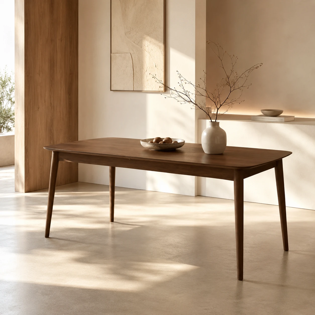
Cold minimalism removes. Warm minimalism replaces. That is the whole distinction, and it explains every decision underneath it.
In a cold minimalist room, you take out the pattern, the colour and the clutter, and what is left is empty. In a warm minimalist room, you take out the same things and put texture back in their place. The interest that used to come from having a lot of objects now comes from the surfaces themselves: the grain in a solid timber table, the slub in a linen cushion, the loop of a boucle weave, the matte pit of honed stone.
It is worth being clear about what it is not. It is not beige everything. A room where the sofa, the rug, the walls, the curtains and the cushions are all the same warm off-white is not warm minimalism, it is a room with one idea in it. The warmth comes from contrast in texture while colour stays quiet, not from removing contrast altogether.
The materials that do the work
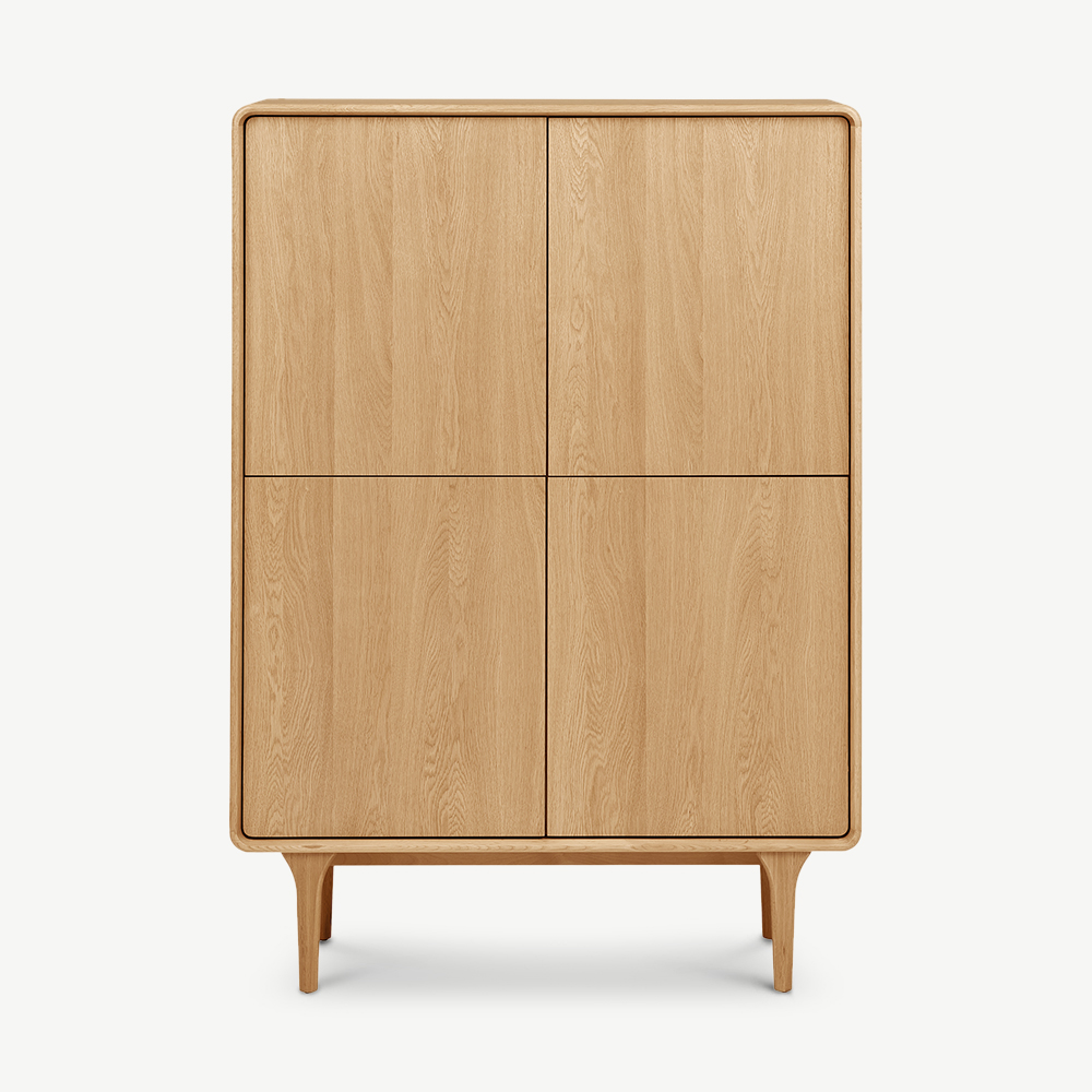
Wood tone is the single biggest lever and the easiest to get wrong. Pale grey-washed oak, which carried the last decade, reads cold under European daylight because the grey undertone cancels the yellow in the timber. Warm minimalism runs on woods with a red or amber undertone: walnut, teak, cherry, and oak in its natural or lightly oiled state rather than limed or whitewashed.
A practical test before you buy: look at the timber next to something genuinely neutral, like a sheet of printer paper. If the wood looks slightly green or blue against the paper, it will read cold in the room. If it looks amber or pink, it will read warm. You do not need every piece to match, either. One dominant wood tone and one contrasting one is more interesting than a matched set, and it is easier to live with, because replacements do not have to be exact.
Stone and metal follow one idea between them, which is how the surface handles light.
- Honed, not polished, on stone: a honed marble or travertine top absorbs light and shows its depth, where a polished top throws a hard reflection that fights the softness around it.
- Brushed, not mirror-finish, on metal: brushed brass, blackened steel and antique bronze sit quietly. Chrome does not.
How to read the upholstery numbers
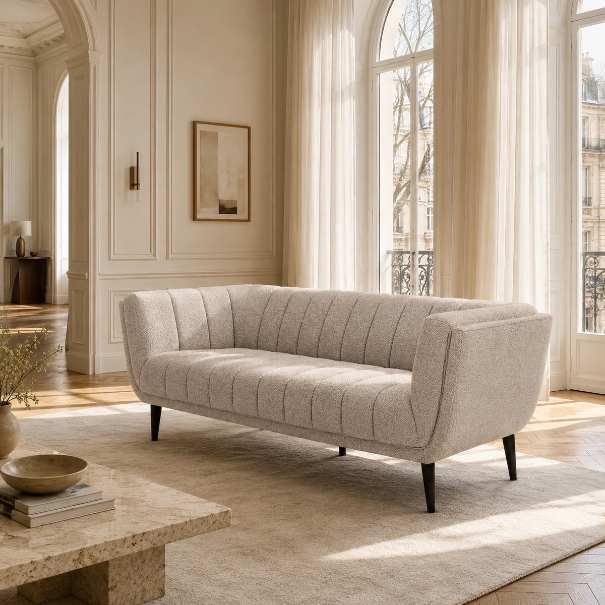
Texture is the point, so upholstery choice matters more here than in a conventional scheme. Wool, slubbed linen, chenille and boucle all carry warm minimalism well. The question is where each one belongs.
Martindale is the standard European abrasion rating, and it tells you how many rub cycles a fabric survives in testing. The numbers that matter in practice:
The practical rule: put your most tactile fabric where it gets touched but not sat on all day. A boucle or high-pile wool works beautifully on an armchair used in the evening and looks tired fast on the sofa the whole family lands on. Put the tougher weave on the sofa and let the chair carry the texture.
The palette, with actual proportions
Warm minimalism is usually described in moods rather than colours, which is why so many attempts end up looking like a hotel lobby. Here is a ratio that works, in real colours rather than adjectives. If you want it pre-assembled, The Earthy Tones Collection covers the mid-tone layer, and Colours of October covers the depth notes.
Grounding neutral
Walls, the largest rug, the sofa. Warm off-white, oatmeal, mushroom, putty. The test is the same as for timber: it should look faintly yellow or pink against printer paper, never faintly grey.
Mid-tone
Timber, leather, a second textile. This is where walnut, teak, tan leather, clay and olive live. It is the layer most people skip, and skipping it is why a room can be full of nice pieces and still look flat.
Depth
One or two darker or more saturated notes: burgundy, forest green, deep navy, blackened metal. A single cushion, a lamp base, the frame of a chair. Without it the room has no bottom note and reads washed out in winter light.
Calm, without empty
The most common failure in a minimalist room is not clutter, it is a room that has been correctly emptied and now feels like a waiting area. Four things fix it.
- One anchor piece. Every room needs a single object your eye lands on first: a substantial sofa, a sculptural armchair, a large low table. If everything is the same visual weight, the eye keeps moving and the room never settles.
- Group in odd numbers. Three objects on a sideboard read as arranged; four read as stored. An odd group has a centre, an even group splits.
- One strong texture per plane. Floor, seating, walls and table each get one textural idea. A high-pile rug under a boucle sofa with a woven wall hanging behind is three competing ideas in one sightline.
- Leave the negative space alone. The empty wall and the clear half of the sideboard are doing work. They are what makes the few objects you kept feel deliberate. The urge to fill them is the urge that undoes the whole scheme.
Five pieces that carry the room
If you are building the look from scratch, these five do most of it and everything else is optional.
Warm minimalist pieces from this guide


The four mistakes that make it look cheap
- Buying the matching set. A three-piece suite in one fabric removes every texture contrast in the room in a single purchase. Two different seating fabrics is the minimum for the look to work.
- One texture everywhere. Boucle sofa, boucle chair, boucle cushions. The weave stops reading as a deliberate choice and starts reading as the only thing that was in stock.
- Cool-white bulbs. The single cheapest way to ruin a warm palette. A 4000K or 5000K bulb pulls the yellow out of every timber and textile the moment it gets dark. Check the box, not the fitting.
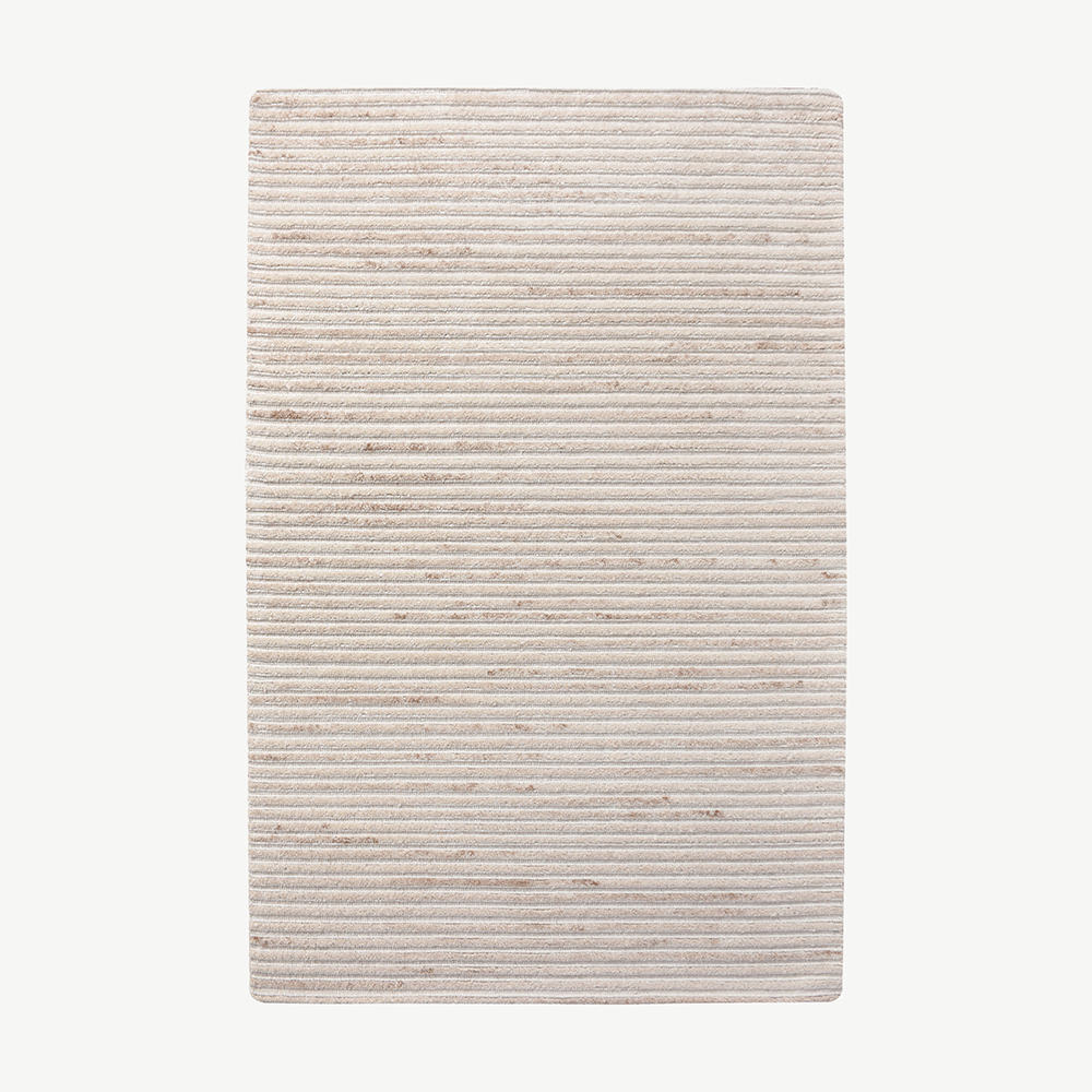
- An undersized rug. A rug that does not reach under the front legs of the seating makes the furniture look like it is floating and the room look unfinished. As a rule, the front legs of every seat in the group should stand on it.
Built to last past the trend
One trend fabric everywhere dates fast. Proportion and texture do not.
Warm minimalism holds up because it rests on how a room is composed, not on a single signature piece bought in quantity. Get the grounding neutral, one honest wood tone and one anchor piece right, and the room still reads considered in five years. Buy the timber and the sofa for the long term, and treat the boucle chair and the cushions as the layer you are willing to change.
Our Warm minimalism collection and Quiet luxury collection are built around exactly this combination.
Frequently asked.
Is warm minimalism the same as quiet luxury?
They overlap but are not identical. Warm minimalism describes how a room is composed: few objects, restrained colour, texture carrying the interest. Quiet luxury describes the buying standard: high quality materials and craftsmanship without visible branding. A warm minimalist room is usually furnished on quiet luxury principles, but you can apply either idea without the other.
What colours work for warm minimalism?
Warm off-white, oatmeal, mushroom and putty as the base, then clay, olive, tan and warm timber tones as the mid-layer, with small amounts of burgundy, forest green or blackened metal for depth. The test for any neutral is that it should look faintly yellow or pink against white printer paper, never faintly grey.
Does warm minimalism work in a small living room?
Yes, and it often works better in a small room than conventional minimalism does. Because the interest comes from texture rather than from the number of objects, a small room can feel rich without being crowded. Keep to one anchor piece, one strong texture per surface plane, and a rug large enough for the front legs of the seating.
What is the difference between warm minimalism and Japandi?
Japandi is a specific fusion of Scandinavian function and Japanese restraint, with low profiles, visible joinery and a tighter palette. Warm minimalism is broader and less rule-bound: it borrows the restraint but allows heavier upholstery, deeper colours and more varied wood tones. Most Japandi rooms qualify as warm minimalist, but the reverse is not true.
Is warm minimalism going to date quickly?
The composition principles are unlikely to date because they are about proportion and texture rather than a specific motif. What dates is the shorthand: a single trend fabric used everywhere, or one signature silhouette bought in quantity. Buy the timber and the sofa for the long term, and treat the boucle chair and the cushions as the layer you are willing to change.
